WELCOME TO BRUSHED WEEK!
Today I continue to highlight the Brushed / Animal Kingdom workshop I designed while at the same time showing you my technique for artfully highlighting patterned papers with Cricut cuts..
This week I am using the Brushed paper packet to create layouts for Disney's Animal Kingdom. Brushed is an older paper packet that was "refreshed" with new colors and brought back by popular demand. The first time I saw the Bohek patterned paper, I thought of the Rivers of Light show at Disney's Animal Kingdom.
What is Bohek? In photography, bokeh is the aesthetic quality of the blur produced in the out-of-focus parts of an image produced by a lens. Bokeh has been defined as "the way the lens renders out-of-focus points of light".

You can see the points of light on the paper, with the blurred edges of those points of light. I couldn't think of a more perfect pattern for use in a "Rivers of Light" layout. At the same time, I knew I want to bring in the lotus image, so here is two page 12x12 River of Light Scrapbook Layout as I set it up in Design Space.

My vision was that all of the lotus pieces would be cut from a single sheet of the Bokek paper as follows:
1) the left most floating lotus mostly yellow
2) the middle lotus on the left page some yellow fading into pink
3) the middle lotus on the right page mostly pink
4) the right most lotus on the right page some pink fading into yellow
5) the top cluster of lotus of pink so the yellow titlw shadow would not be lost in the lotus
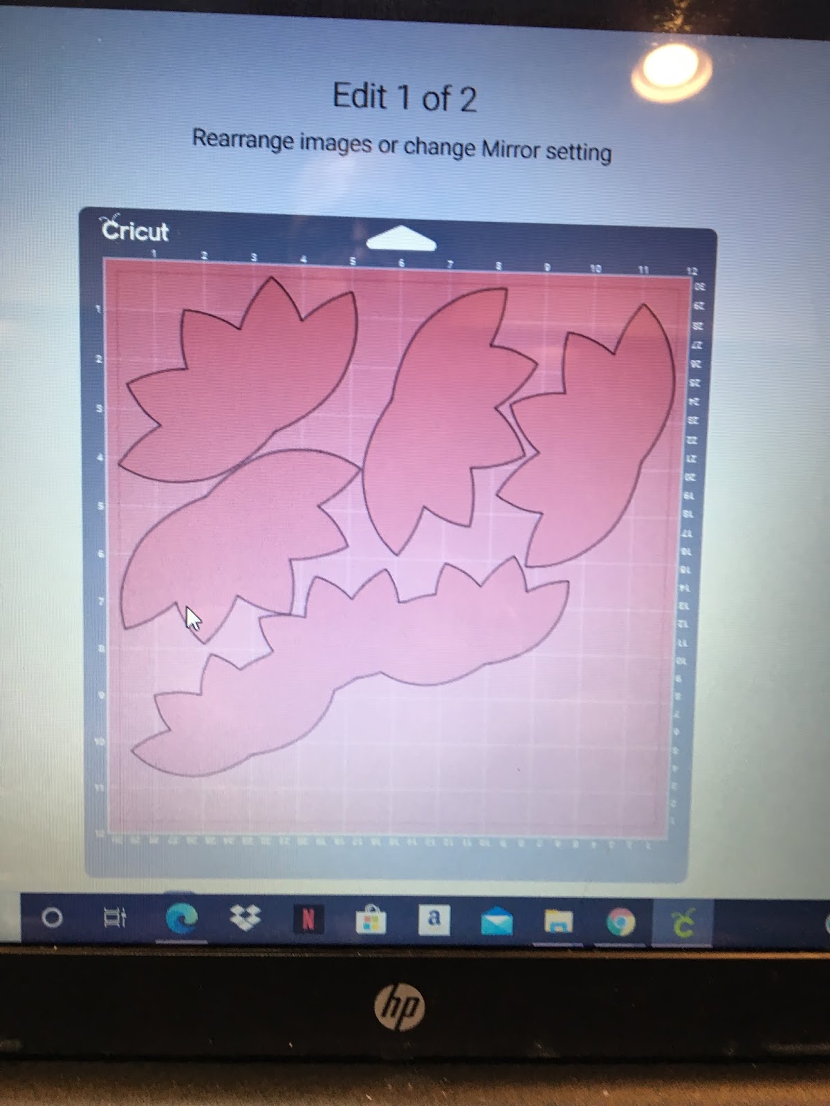
When Cricut lined up the images to be cut, here is what I got.

First of all, design space spread the cuts across 2 sheets of paper with a lot of wasted space. Second of all, the lotus's were not aligned on the paper to cut giving me the colors I had envisioned. So I moved the cuts.
1) I pulled the images of the 3 welded lotus's for the title to the bottom of the sheet to move it out of the way
2) I pulled one of lotus images up to the top left and rotated toward the left top corner to get the a lot of yellow into the cut
3) I pulled one of lotus images up to the top right and rotated toward the left top corner to get some pink fading into yellow for the cut

4) Next, I had to move the 2 lotus images from mat 4 to mat 3
- Choose the image on mat 4
- Click on Move Object
- You will be given a choice of mat to move the object to. Choose Mat 3.
- When the check mark is shown on Mat 3, click the confim button.
- Cricut will place the image at the top left corner. Move the image so it face the lotus in the right hand top corner, thus placing it to cut with yellow on the left side and pink on the right side.
- Repeat the steps to move the second 2 lotus images mat 4 to mat 3. This time, place the lotus under the first lotus in the left hand top corner.
 |
| Click on Move Object |
 |
| Choose Mat 3 |
 |
| Confirm choice of mat |
 |
| After moving to mat place image as required |
This is what the image placement on my mat looked like before I cut.

I had my images very close but not overlapping.
VERY IMPORTANT!!
1) Make sure that none of your images are touching each other before cutting!
2) Make sure you put the mat in the Cricut with the yellow portion of the paper going in first, or your images will be cut upside down (standing on their heads)
3) Leave enough paper to cut the hibiscus flowers for the Stitch layout
It is also important to make sure you have enough paper in the bottom right to cut the flowers for the Stitch layout. I put the bottom layer of the hibiscus flowers slong the bottom edge where it is very dark red. I cut the 2 pixie hibiscus flowers from the pink section along the right edge.
Some of you might be asking WHY??
Well, if I had cut the layout using plain cardstock, it would be kind of boring. Using patterned paper for you Cricut cuts amps up the layout to make it more interesting.
My vision realized:


My vision was that all of the lotus pieces would be cut from a single sheet of the Bokek paper as follows:
1) the left most floating lotus - mostly yellow
2) the middle lotus on the left page - some yellow fading into pink
3) the middle lotus on the right page - mostly pink
4) the right most lotus on the right page - some pink fading into yellow
5) the top cluster of lotus - pink so the yellow title shadow would not be lost in the lotus
Check back tomorrow to see the title for the Rivers of Light layout and Friday (Finish it Friday) for the finished layout.
Stay well and Happy crafting!!
And remember all Cricut and general crafting questions are welcome!!
TINA Stanczak
Pinterest | https://www.pinterest.com/niallsmama
No comments:
Post a Comment