Tuesday, July 14, 2020

Technique Tuesday - Stamping OFF the Edge (Birthday Card)

WELCOME TO BIRTHDAY BASH WEEK!

Today, for Technique Teusday, I continue to highlight the July Stamp of The Month (SOTM) from Close To My Heart. I am going to push to work outside of my box again, making a couple more birthday cards

For My Beautiful Friend—July Stamp of the Month

I turned to facebook again for inspiration. I found this really beautiful card made by fellow consultant Michelle Stewart....yep, I can do this. I can stamp off the edge of the card.

Step 1) Stamp Happy Birthday inside the card. I always stamp the inside first so if I mess it up, I can cover it up & make it the front of the card.

Step 2) take a card base, tape it down to the All-purpose Mat  & stamp around the outside of it using the edges of the girl with the boquet stamp. I just kept turning her so different parts of the boquet edge were being using as I moved around the card in a clockwise direction. I stamped on my All-purpose Mat then pulled the card up & wiped up the ink before moving to the next step.
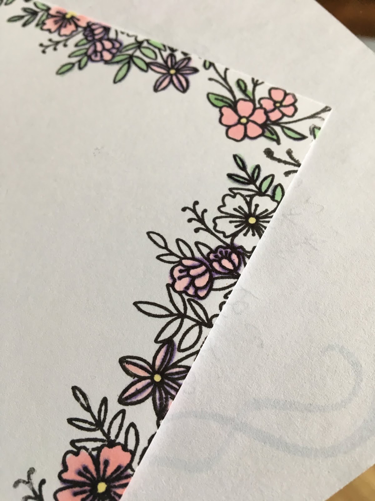
Step 3) Stamp the boquet girl, stamp the "Just for You", and the small butterflies on a peice of 4 3/4 by 3 1/2 white daisy cardstock. 

Step 4) Color NOTE: I always put a piece of scratch paper under the card when coloring since I was coloring on the edges. I probably should have done my coloring on my All-purpose Mat but I forgot to move it to the table where I was coloring.


I will admit, I handed my daughter the markers and asked her to color. She colored the purple flower card, then I copied the look on the pale pink flower card. 
I am so much happier with today's cards.  I showed these cards to some ladies with whom I was doing on online crop, and they asked where I got the patterened paper.  #Success

Finished Cards
Here is a list of the markers used to make these cards:
  1. Fair Skin TriBlend™ Marker for the legs and arms
  2. Dull Green TriBlend™ Marker for the leaves and stems
  3. True Blue TriBlend™ Marker for the small butterflies and the dress
  4. Hydrangea TriBlend™ Marker and Purple TriBlend™ Marker for flowers, card on left
  5. Pale Pink TriBlend™ Marker for the flowers on the right card
So happy with todays results!! I am getting better with coloring. These cards turned out lovely. Now, to get them in the mail so this weeks birthday girls get their cards on time!!. 

Join me tomorrow for Work On it Wednesday.....you guessed it featuring another birthday card using the July Stamp of The Month (SOTM).

Stay well and Happy crafting!!
TINA Stanczak
Facebook |     Emptynest   Scrapin   (private group for project instructions)

Monday, July 13, 2020

Motivation Monday - July Stamp of The Month (SOTM)

WELCOME FELLOW PAPERCRAFTERS!


This week (week 18 of COVID 19 isolation) I am working with the July Stamp of The Month (SOTM) from Close To My Heart. Out comes my terrible secret....for all the crafting supplies I own, I do not usually make handmade cards. 

For My Beautiful Friend - July Stamp of the Month

I decided to dive right in with a birthday card that was inspired by a card I saw on facebook. 
This month I need birthday cards for a long list of people. Last week we celebrated 3 famly birthdays and 2 friend birthdays. This week there are 2 more family birthdays. I need to get rolling. 

Monday July SOTM card
I stamped the corners first with the stamp on the bottom left corner of the stamp sheet. Next I stamped to left and right sides with the stamp on the bottom right of the stamp sheet. I used the same stamp on the bottom of the card, first placing a post it note on the left corner. I needed to cover the corner because the stamp was too long and I did not want to cover up the corner stamp.

To complete the card, I stamped the Happiness saying, followed by the large butterflies, then the small butterflies. After stamping all the outlines, I started coloring. I am not much of a colorer...just like I am not much of a card maker.  Lol, I am thinking you could tell by looking at the card. It's Monday, try something new with me.

I starting with the flower in bottom left corner, experimenting with bright pink and Pale Pink TriBlend™ Marker. The two colors did not blend at all. 
Coloring the flowers
On to another color combination. I gave blending the medium and light Pale Pink TriBlend™ Marker a try on the flowers in the bottom right. These blended too well. The flowers do not look like they have any shading at all. In the end, I just used the light tip of the Pale Pink TriBlend™ Marker to color all of the flowers.

I colored the small butterflies light yellow using the Light Yellow TriBlend™ Marker.  For the larger butterflies I used the light tip of the Orange TriBlend™ Marker on the inside of the butterfly and then colored the same yellow marker on the tips of the wing.  Another fail! I used the medium tip of the Orange TriBlend™ Marker close to the butterfly body and then tried to blend using the light tip of the Orange TriBlend™ Marker. Yeah, not thrilled.

After coloring the butterflies, I decided to "fix" the card by adding some shimmer to the large butterflies and popping another "flying" butterfly on top of the ugliest of the butterflies.

Very seldom to I feel like I am adding lipstick to a pig but in this case....lol. Well the point of Motivatin Monday (or Make it Monday) is to simple motivate myself to make something. Which I did. 

Sometimes we need to remind ourselves, it was just a piece of paper. After all both Van Gogh and Monet painted over their canvases whenever they were not pleased.

Hoping for better results tomorrow for Technique Tuesday.

Stay well and Happy crafting!!
TINA Stanczak
Facebook |     Emptynest   Scrapin   (private group for project instructions)

Friday, June 26, 2020

Finish It Friday - Brushed Animal Kingdom Rivers of Light Scrapbook Layout

WELCOME TO BRUSHED WEEK!

Today I am finishing my work on the River of Light Scrapbook Layout for my Brushed / Animal Kingdom workshop. 

Reminder, this workshop features a two page 12x12 Rivers of Light Scrapbook Layout, along with a Stitch layout. All of the layouts in this workshop use the Brushed Paper packet. Brushed is an older paper packet that was "refreshed" with new colors and brought back by popular demand. Yesterday I showed how I made the title for the layout.  Today I am going to fill in a few more details needed to create the Rivers of Light layout.

When you open the design space file, you will see the below image.

Generally, I will hide the photo mats before cutting. The white rectangles are the "Place Photo Here" (photo place holders, so I also hide those so I don't cut them). I leave the photo mats in DS so you will know where the photos should be placed.

Once the photo mats are hidden, Cricut will sort the cuts onto 14 mats. After you make the adjustments shown on Tuesday blog post for cutting the lotus flowers, you will be working with 13 mats.

Mat 1 = Pewter scrap (light side) for large rock
Mat 2 = Bokeh patterned paper for lotus flowers
Mat 3 = Mink scrap for small rock
Mat 4 = Canary (light side) 4x6 piece for RIvers of Light title
Mat 5 = Green Apple (dark side) 3x6 piece for RIvers of Light title
Mat 6 = Green Apple dotted patterned paper for reeds
Mat 7 = Bluebird (light side) for waves
Mat 8 = Bluebird (dark side) -> use same mat but insert into Cricut with uncut cardstock at top
Mat 9 = Saphire (light side) for water
Mat 10 = Black  NOTE: Design Space puts the Black cuts on 2 mats. I moved the cuts on to a single mat.
Mat 11 = Saphire (dark side) for water
Mat 12 = Kraft Cardstock for star template.

After cutting all of the pieces, I inked all of the water pieces (bluebird, sapphire light side and sapphire dark side) with Bluebird ink. Then I inked the wave pieces with Carolina at the bottom of the wave and added clear shimmer brush to the top of the wave to make it look more like water.

The rocks are also inked using Charcoal (because I don't own a Pewter ink pad). I think either would work just as well. Next, I glued the layout together (minus the title). 

If I was to make this lyout again, I would first use a gold shimmer brush to add stars to the black, then glue all the peices down. Instead, I created a star template in DeisgnSpace and used the template to add stars to my layout with stickles. 

Here is what the final two page 12x12 River of Light Scrapbook Layout. 
Rivers of Light - full layout
Rivers of Light Left page
Rivers of Light - Right Page


Please email or Facebook PM to purchase the Cricut DS file for $3.50, or a fully cut layout kit for $10 (available thru July 17th).

Check back Tuesday (Technique Tuesday) for the higlights on using a Cricut cut template to make stars with stickles.

Stay well and Happy crafting!!
And remember all Cricut and general crafting questions are welcome!!
TINA Stanczak

Facebook |     Emptynest   Scrapin   (private group for project instructions)

Wednesday, June 24, 2020

Work on It Wendesday - Brushed Animal Kingdom Rivers of Light Scrapbook Layout

WELCOME TO BRUSHED WEEK!

Today I am continuing my work on the River of Light Scrapbook Layout for my Brushed / Animal Kingdom workshop. After two days of work, I had designed the main portion of the layout and figured out how to cut the lotus flowers to my satisfaction but I was missing a title. I had created the layout in design space without the title, then cut all of the pieces except the title, because I couldn't decide what colors to make the title.

Reminder, this workshop features a two page 12x12 Rivers of Light Scrapbook Layout, along with a Stitch layout. All of the layouts in this workshop use the Brushed Paper packet. Brushed is an older paper packet that was "refreshed" with new colors and brought back by popular demand. Yesterday I showed how to make lotus flowers using the Bohek patterned paper for the Rivers of Light layout.

Here is what the two page 12x12 River of Light Scrapbook Layout without the title. 


For me, scrapbooking is a creative process. I am very visual, which is why I love to setup my full layout in Design Space with the correct colors and patterns to see what the final project will look like and watch my vision become reality.

Since I couldn't make up my mind what colors to make the title, I cut and glued all the other pieces. Before gluing down all the pieces I had to make a key decision....do I leave the layout as above, or sort out a different solution for the edges. Since you can not cut a 12 inch piece without a 24 inch mat, the blue pieces for the river were only 11 1/2 inches across. I wasn't thrilled about how the layout looked in design space, so I started experimenting with other options. In the end, I decided to go with the African looking Zip/Branding strip. Refer to the below picture for the zip strip I am referring to.

It seemed to me that this zip strip pattern was perfect for a Disney Animal Kingdom layout with the African vibe it gives off. After attaching the zip strips to the right and left sides, it was pretty clear I needed to use the Green Apple and Canary Yellow as the title colors. First, I tried the canary on top with the green apple as the shadow. Again, not thrilled. I switched the colors and liked this combo a lot better.  The green apple was now forming a visual triangle from the zip strip on the left, to the title at the top, to the reeds at the bottom right of the layout.

Now to cut the title and add to the cluster of lotus flowers.


After looking at the title shadow on the pink lotus, I decided to ink the tite shadow with canary to make it pop more off the pink lotus cluster. I also inked the words in green apple so they would pop of the canary background shadow. 

I glued the canary yellow title shadow to my lotus cluster, centering the title shadow on the cluster of lotus flowers. I added "Rivers", "of", "Li" and "ght" pieces in that order. NOTE: the picture above shows the final layout. The lotus flowers were not glued to the layout when I was working on the title. 

Here are more pictures of the finished tite.


If you would like a private tutorial on creating your own titles or adding a drop shadow to an existing title, please email or Facebook PM to setup a private class time. I offer private Cricut training.

Check back Friday (Finish it Friday) for the finished layout.

Stay well and Happy crafting!!
And remember all Cricut and general crafting questions are welcome!!
TINA Stanczak
Facebook |     Emptynest   Scrapin   (private group for project instructions)

Tuesday, June 23, 2020

Technique Tuesday - Animal Kingdom Rivers of Light (Using Patterned Paper in Cricut layouts )

WELCOME TO BRUSHED WEEK!

Today I continue to highlight the Brushed / Animal Kingdom workshop I designed while at the same time showing you my technique for artfully highlighting patterned papers with Cricut cuts.

This week I am using the Brushed paper packet to create layouts for Disney's Animal Kingdom. Brushed is an older paper packet that was "refreshed" with new colors and brought back by popular demand. The first time I saw the Bohek patterned paper, I thought of the Rivers of Light show at Disney's Animal Kingdom.

What is Bohek? In photography, bokeh is the aesthetic quality of the blur produced in the out-of-focus parts of an image produced by a lens. Bokeh has been defined as "the way the lens renders out-of-focus points of light".


You can see the points of light on the paper, with the blurred edges of those points of light. I couldn't think of a more perfect pattern for use in a "Rivers of Light" layout. At the same time, I knew I want to bring in the lotus image, so here is two page 12x12 River of Light Scrapbook Layout as I set it up in Design Space.
My vision was that all of the lotus pieces would be cut from a single sheet of the Bokek paper as follows:
1) the left most floating lotus mostly yellow
2) the middle lotus on the left page some yellow fading into pink
3) the middle lotus on the right page mostly pink
4) the right most lotus on the right page some pink fading into yellow
5) the top cluster of lotus of pink so the yellow titlw shadow would not be lost in the lotus

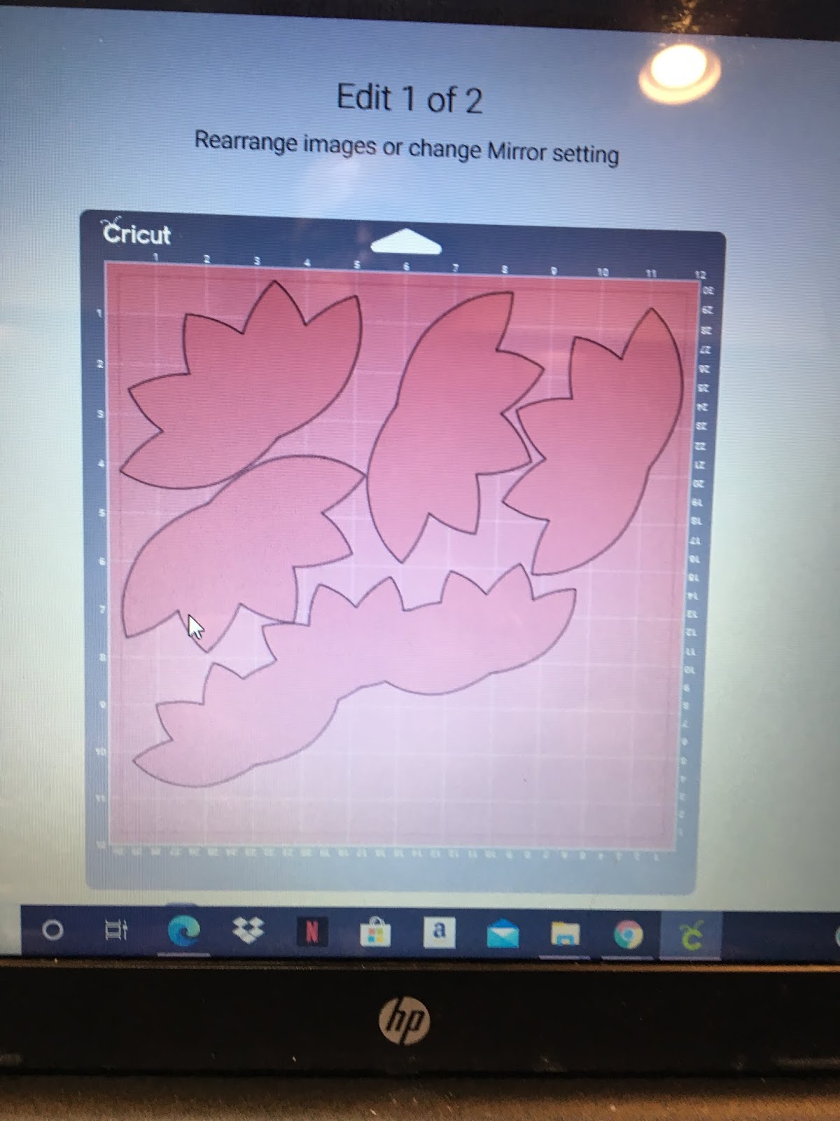
When Cricut lined up the images to be cut, here is what I got.
First of all, design space spread the cuts across 2 sheets of paper with a lot of wasted space. Second of all, the lotus's were not aligned on the paper to cut giving me the colors I had envisioned.  So I moved the cuts.

1) I pulled the images of the 3 welded lotus's for the title to the bottom of the sheet to move it out of the way
2) I pulled one of lotus images up to the top left and rotated toward the left top corner to get the a lot of yellow into the cut
3) I pulled one of lotus images up to the top right and rotated toward the left top corner to get some pink fading into yellow for the cut

4) Next, I had to move the 2 lotus images from mat 4 to mat 3
  • Choose the image on mat 4 
  • Click on Move Object
  • You will be given a choice of mat to move the object to. Choose Mat 3.
  • When the check mark is shown on Mat 3, click the confim button.
  • Cricut will place the image at the top left corner. Move the image so it face the lotus in the right hand top corner, thus placing it to cut with yellow on the left side and pink on the right side.
  • Repeat the steps to move the second 2 lotus images mat 4 to mat 3. This time, place the lotus under the first lotus in the left hand top corner.
Click on Move Object

Choose Mat 3
Confirm choice of mat
After moving to mat place image as required
This is what the image placement on my mat looked like before I cut.
I had my images very close but not overlapping. 
VERY IMPORTANT!! 
1) Make sure that none of your images are touching each other before cutting!
2) Make sure you put the mat in the Cricut with the yellow portion of the paper going in first, or your images will be cut upside down (standing on their heads)
3) Leave enough paper to cut the hibiscus flowers for the Stitch layout

It is also important to make sure you have enough paper in the bottom right to cut the flowers for the Stitch layout.  I put the bottom layer of the hibiscus flowers slong the bottom edge where it is very dark red. I cut the 2 pixie hibiscus flowers from the pink section along the right edge.
Some of you might be asking WHY??

Well, if I had cut the layout using plain cardstock, it would be kind of boring. Using patterned paper for you Cricut cuts amps up the layout to make it more interesting.

My vision realized:

My vision was that all of the lotus pieces would be cut from a single sheet of the Bokek paper as follows:
1) the left most floating lotus - mostly yellow
2) the middle lotus on the left page - some yellow fading into pink
3) the middle lotus on the right page - mostly pink
4) the right most lotus on the right page - some pink fading into yellow
5) the top cluster of lotus - pink so the yellow title shadow would not be lost in the lotus

Check back tomorrow to see the title for the Rivers of Light layout and Friday (Finish it Friday) for the finished layout.

Stay well and Happy crafting!!
And remember all Cricut and general crafting questions are welcome!!
TINA Stanczak
Facebook |     Emptynest   Scrapin   (private group for project instructions)

Monday, June 22, 2020

Motivation Monday - Cricut Stitch Scrapbook Layout

WELCOME FELLOW PAPERCRAFTERS!


This week (week 15 of COVID 19 isolation) I am working with the Brushed Paper Packet from Close To My Heart. Brushed is an older paper packet that was "refreshed" with new colors and brought back by popular demand. I love the summer colors.  

As you know, I have been working on both Disney scrapbook layouts and my Alaskan Cruise album concurrently,  As I was flipping through my Disney photos, it struck me that these colors would be perfect for our Animal Kingdom photos, especially the new "Pandora" section of the park.   

I started by creating a "Stitch" layout since we have some older photos with Stitch from way back, when Stitch could be found in Camp Minnie / Mickey. Camp Minnie / Mickey was replaced with Pandora. This layout could easily work for Hawaii photos, Disney Aulani, or any cruise photos since the layout has a tropical flavor.

I was hoping that getting this layout completed would motivate me to use the whole paper packet and create some awesome layouts that are currently showing up in my dreams.
  
I used a piece of the brushed leafy pattern paper for my background. I cut the tops of the palm trees out of the brushed green dotted patterned paper. I also cut the bottom layer of the Hibiscus flowers out of the bokeh patterned paper. The patterned papers I used are shown below. The remaining Cricut images were all cut using various colored CTMH cardstock.

All of the Cricut images in the cut file are Close To My Heart images or free images so you DO NOT need a Disney cartiridge to make this layout.
  
When I make my layouts, I don't always cut the colors in the order that Design Space lays out the mats. 
  1. In this case, I cut the Canary (mat #9) first. I inked the edges of the sunshine and adhered to the base of the layout (be sure to cut the branding/zip strip off before adhering the sunshine).
  2. Next I cut the top layer of the surf board and the leaves using the dark side of Green Apple cardstock (mat #10). I inked the edges of all pieces with Green Apple ink.
  3. After this, I moved on to the beach. The beach was cut using both the dark side and light side of toffee card stock. I cut larger portion of the beach (mat #7) with the dark side of toffee card stock. The I turned it over and put the uncut portion of the paper to the top of my cricut mat to cut the smaller portion of the beach and the bottom layer of the palm trees (mat #8) from the light side of the toffee cardstock. I inked both section of the beach with toffee ink (refer to picutre) then adhered the left sides together.  Wait....don't adhere this to the base page yet, as the water needs to be adhered first.
  4. This next step is a little tricky. The palm tree consists of 3 layers (bottom -> cut from the light side of toffee cardstock, middle = leaves, and top layer of tree). The top layer of the tree is mat # 6 (dark brown). I was able to cut the tree trunks from the same sheet of cardstock I cut the beach images from. Before cutting, check two things: 1) make sure the images fit on the paper (spin or move to fit as needed), and 2) make sure the dark side is up. I inked the tree trunks using Expresso PIGMENT ink because pigment ink is very wet and can be used almost like paint. Then I dabbed ink onto the coconuts (refer to picture above). Alternatively, you can cut the tree trunks using Espresso Cardstock
  5. Wanting to finish the palm trees, I cut mat #11 (the tree tops) usng the green dot patterned paper. I inked the tree tops with green apple to give them definition, then moved to the next step before gluing all the palm tree pieces together. Note: I generally wait 15 minutes between inking and gluing to ensure the ink is dry before I glue all the pieces togehter. This is very important with the pigment ink because it will get everything covered in ink if you don't give it time to dry.
  6. I cut the water pieces next. I cut the larger water piece (mat # 12) using the dark side of glacier, then cut the wave (mat #13) using the dark side of Lagoon cardstock. If you like, you could cut the larger water piece using the light side of the lagoon cardstock. I wanted a stronger contrast so I used a lighter color for the water versus the wave. I inked the wave and the top of the water using lagoon ink, then I adhered them together. Before adhering the water to the base sheet, I cut it at the 2 1/4 inch point since it is only 11.5 inches long. I adhered the shorter water piece to the left side and the longer water piece to the right side.
  7. After adhering the water pieces, I glued down the beach and then the palm trees, followed by the surf board. I use this method so I don't lose any peices as I go along.
  8. I moved to the flowers next. As mentioned earlier, I cut the bottom layer of the flowers using the bakeh patterned paper. I cut a 6x4 piece from the darkest portion of the paper (as shown on the right below). Before cutting the images, I changed the mat size (mat #3) to 4x6 as shown on the left below. This forces Design Space to put all the images on the paper,
  9. Having cut the bottom layer of the flowers, I cut the white images (mat #1). I adhered the 3 white flower tops to the bottoms, then inked the edges of the flowers using Pixie ink.
  10. To finish the flowers, I cut the pixie flower images (mat #4). Again I adhered the pixie flowers to the bokah patterned paper, then inked 3 flowers with Pixie ink..
  11. To finish off the flowers, I cut the black next. To avoid losing any of the pistils. I peeled then off the Cricut mat one by one and adhered to the flowers before remvoing the next pistil. After finishing the flowers, I adhered the photo mat, all but the one small white flower and the leaves that go with the flowers.
  12. The last three mats/colors are Ballerina (the insides of Stitchs ears and his tongue),the light blue (dark side of Carolina) and the dark blue (dark side of bluebird). I cut these colors and layered Stitch together. 
The highlights I added to Stich included using the black journalling pen to add his upper lip and outline his nose. I also used a white gel pen to add the whites of his eyes. 

The last steps to the layout are to adhere Stitch and the final flower. 

All in all, I LOVE the way this layout turned out. All of the Cricut images in the cut file are Close To My Heart images or FREE images so you DO NOT need a Disney cartiridge to make this layout.

If you would like to create this layout me, contact me to purchase the Cricut DS file.

Stay well and Happy crafting!!
TINA Stanczak
Facebook |     Emptynest   Scrapin   (private group for project instructions)
However, the Cricut cut files can be used with CTMH cardstock and other items you have in your stash to complete this layout.